
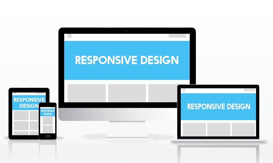
In the era of diverse digital devices and varying screen sizes, creating a seamless and engaging user experience across platforms has become a paramount concern for web designers and developers. Responsive Website Design (RWD) emerges as a solution to this challenge, offering a dynamic approach to crafting websites that adapt effortlessly to the myriad of devices users utilize. This article explores the principles, benefits, challenges, and the evolution of responsive website design, showcasing its pivotal role in shaping the modern digital landscape.
Principles of Responsive Website Design
Responsive Website Design is grounded in a set of principles that prioritize flexibility, adaptability, and user-centricity:
- Fluid Grids
Instead of fixed-width layouts, responsive designs employ fluid grids that proportionally resize elements based on a percentage of the screen width. This ensures a consistent user experience across devices.
- Flexible Images
Images within a responsive design are also flexible, adjusting their size proportionally to the screen width. This prevents images from being cropped or distorted on different devices.
- Media Queries
Media queries enable the application of specific styles or layout adjustments based on the characteristics of the user’s device, such as screen size, resolution, or orientation. This allows for targeted customization of the user interface.
Benefits of Responsive Website Design
- Enhanced User Experience
Responsive designs provide a seamless and consistent user experience across various devices, eliminating the need for users to zoom or scroll excessively.
- Increased Accessibility
By catering to a diverse range of devices, responsive designs make content accessible to a broader audience, including users on smartphones, tablets, laptops, and desktops.
- Improved SEO Performance
Search engines like Google favor responsive websites, as they provide a consistent URL structure and content across devices. This can positively impact search rankings.
- Time and Cost Efficiency
Developing a responsive website eliminates the need for separate designs and development efforts for different devices. This streamlines the development process and reduces overall costs.

Challenges in Responsive Design Implementation
While responsive design offers numerous advantages, its implementation comes with its own set of challenges:
- Complexity of Design
Crafting a responsive design that looks appealing and functions seamlessly across devices requires careful consideration of layout, content prioritization, and visual elements. Achieving a balance can be complex.
- Performance Optimization
Ensuring that the website performs efficiently on various devices may require optimizing images, minimizing HTTP requests, and utilizing techniques like lazy loading.
- Browser Compatibility
Different browsers may interpret and render responsive designs differently. Extensive testing is required to ensure compatibility across popular browsers and their versions.
- Content Prioritization
Displaying the most critical content on smaller screens while maintaining a visually appealing layout can be challenging. Deciding what to prioritize on different devices requires strategic thinking.
Evolution of Responsive Website Design
Responsive Website Design has evolved over the years to meet the changing landscape of technology and user expectations:
- Mobile-First Approach
With the rise of mobile device usage, designers increasingly adopt a mobile-first approach, prioritizing the development of the mobile version of a website before scaling up for larger screens.
- Advancements in CSS Frameworks
CSS (Cascading Style Sheets) frameworks like Bootstrap and Foundation have become instrumental in simplifying responsive design implementation. These frameworks offer pre-designed components and grids, streamlining the development process.
- Progressive Web Apps (PWAs)
Progressive Web Apps combine the best of web and mobile applications, offering a responsive and app-like experience. PWAs leverage responsive design principles to ensure optimal performance across devices.
- Incorporation of Flexbox and Grid Layout
Modern layout models like Flexbox and Grid Layout in CSS provide more sophisticated tools for creating responsive designs, offering finer control over the arrangement of elements.
- Focus on Performance Optimization
As user expectations for fast-loading websites grow, there is an increased emphasis on performance optimization in responsive design. Techniques like image compression, lazy loading, and asynchronous loading of scripts contribute to faster load times.

Future Trends in Responsive Design
- Variable Fonts
The use of variable fonts allows designers to create responsive typography that adjusts seamlessly to different screen sizes and resolutions.
- Enhanced Interactivity
With the advancement of technologies like WebAssembly and improved browser capabilities, responsive designs are likely to incorporate more interactive elements without sacrificing performance.
- Augmented Reality (AR) Integration
As AR experiences become more prevalent, responsive designs may need to adapt to AR-enabled devices, providing a seamless blend of the digital and physical worlds.
- Integration with AI
AI algorithms may play a role in optimizing responsive designs by analyzing user behavior and preferences, and dynamically adjusting layouts for personalized experiences.
Conclusion
Responsive Website Design has become an indispensable aspect of web development, ensuring that websites are accessible and engaging across the vast array of devices in use today. As technology continues to evolve, responsive design will adapt and incorporate new trends, providing users with consistent and enjoyable digital experiences. By adhering to its principles and embracing emerging technologies, responsive design remains at the forefront of shaping the ever-evolving landscape of the digital realm.
Leave a Reply